Friday 28 December 2012

Final Evaluation


1).  In what ways does your media product use, develop or challenge forms and    conventions of real media products?


2). How does your media product represent particular social groups?


3). What kind of media institutions might distribute your media product and why?


4). Who would be the audience for your media product?

  
5). How did you attract/address the audience?


6). What have you learnt about technologies from the process of constructing your product?

     
 7). Looking back at your preliminary task, what do you feel you have learnt in the progression from it to the full product?


Friday 14 December 2012

Evaluation of Audience Feedback


Evaluation: Audience Feedback.

Taking into consideration the audience I have received in my magazine composition, it is hinted that my generic audience for my product is fans or young people interested in indie music and possibly rock.

I believe that I should delete the lines in both the contents and DPS pages in order to improve the professionalism of my entire product. In terms of how are particular social groups represented in my magazine I am happy with the response of my feedback.


“The social class for this magazine is for normal educated adults and students. I think this magazine is for both male and female like on the front cover he used a female to be his model so you know this is targeted for both sex because it could be an inspiration to a female and a crush for a guy. The use of colours in his magazine is normal and both male and female would pick up this magazine. I think this magazine is for all races but I think the majority of the readers will be white.”


I intended to create a magazine that is more relatable for female audiences, however it can also approach the male audience as the model in my product can act as “a crush for a guy”.

Thursday 13 December 2012

Magazine Audience Feedback


1).Who is the targeted audience? Are they the group that I initially targeted?

2). How are particular social groups represented in my magazine– fans of particular music, age group, defined by social class/ gender/ethnicity…? Are these representations positive, negative or mixed?

3).Which elements of the magazine do you like?

4).What could be improved?

5). How has my technical and creative skills developed since my college magazine?

Wednesday 5 December 2012

Final Products

I have made changes to all my pages keeping in mind the feedback given by my class mates in my previous post.


For the cover page, I moved the image slightly to the right and lowered it a bit to allow the masthead to show  more and for my selling line "magazine that depicts inspiration" space at the top for a clearer view and to replace its original position which was covering the model´s forehead. I also changed the colour of "British Invasion" to make it easier to read but still concord with the rest of the colour scheme as for the bottom information I took the "starring" and "and more" to conceal the information of the topic, make it concise and hence captivate the customer. I have also included the date and the issue number of the magazine.


As for the contents page I have made several changes. I made the image larger in the left hand side as well as the "contents", took the date and replaced the position of the cover and the introduction of the issue. I also added a pulling quote.  On the right hand side I changed the structure of my pages to give a more organised outlook and fill the blank spaces which I had before which were not effective. I also included a short general overview of each title. I removed my third image as it didn´t work as well as the other ones and places a fashion related one (lower right hand corner). I also included an editor´s note as many magazine include one. 


In my DPS I just added more writting in my article as there was too much blank space in the original draft I have also made bigger the "contemporary" part of the title and added an imaginary photographer and fashion representative as many magazines include this and it crafts a more professional vibe to my product. I also made the font of the article the same as the pulling quote "Orator std".

Thursday 29 November 2012

Layout of my Contents Page


This is my layout of my contents page using InDesign. I still have to add the pictures and the page references under the allocated subheadings (regulars, features, fashion). I also have to add information under the web page subscription. I again must decide whether I will use colours for my fonts or keep it black for formality, I will ask for feedback in order to decide and make improvements.

First draft for the DPS


This is my first draft for my DPS created using InDesign. I have obviously not finished as I have to present my article in the right hand page but apart from that I am happy with the layout and font. I have also need to add a page reference in the right hand side of the spread. I do not know if I am going to apply colour on the spread as it looks formal in black combined with the white background from the right hand side. I will ask for feedback to arrange any more improvements which will be beneficial for the  overall outcome of the project.

Second draft for my cover page


I have made the changes from my previous draft and I am content with the result I will in advance ask for feedback from my teachers and class mates for further improvement on the page.

First draft for the cover page

 
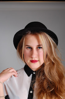
This isn't the finish piece by obvious reasons as their is not enough coverlines nor an explanation for who Simona (the artist) is or what the cover for her is going to be inside the magazine. I will also change the colour of the catching line as it is slightly difficult to read.I am happy with the photography chosen (editted in Photoshop by enlarging it) as it is certainly what I wanted from my photo shoot: an "alluring" image which captivates the customer immediately.

Photo shoot third outfit

 
This is the photo shoot with the third and final outfit I chose for my entire photo shoot period. In this one, I tried to combine both registers (formal and casual) in order to achieve a look which is not common and fit it with my "indie" genre. Hence, I chose a dress (formal piece of clothing) and added a military shirt on top of the dress to give this casual vibe.


Photo shoot second outfit

 
These are some of the phtographs taken in the second outfit chosen. It gives a much more casual look than in the previous shoot.


I then decided to experiment with some of the lighting to give a more vibrant sensation to the image.


Photo shoot first outfit

 
This is the first outfit chosen which presents a more formal atmosphere towards the outcome of the product. I decided not to implement any of the photographs on this part of the photoshoot as I decided to remain with two outfits when crafting my magazine as having different outfits throughout may have looked inconsistent. I also thought that the photographs may have portrayed a very formal look and I decided that being a bit more casual would be more effective for my target audience (yound students more specifically the female audience).


Wednesday 28 November 2012

Images chosen for my actual magazine


IMAGE FOR THE COVER


I chose this photograph for my cover page and enlarged it using Photoshop CS5 in order to make it fit in an A4 paper and engage the audience towards her eyes. I believe this is a strong photograph because in its simplicity it engages the reader her composure is serene (which is what I generally wanted the magazine to embrace) and her look towards the lens of the camera on the actual shoot is effective to allos the customer to feel "allured" which is exactly what I was wanting (hence the name of my magazine "Allur").
IMAGES FOR THE CONTENTS PAGE

I chose this photograph for the "cover issue" in my contents page and enlarged it to nearly fill the entire left hand side of my contents spread. I thought that the implementation of a picture of my main model with a different outfit would look good and I stayed with the same lightning setting in the photographs to concord throughout the magazine and embrace the "serene" overview I wanted to achieve.


I recently went to one of the gigs that my roommate (singer in the photograph) performed in, I took several photographs when they were performing and I thought it would look very professional in my contents page. I also thought that the setting of the bar they performed in "Ths Fiddlers" had an indie/vintage look as being from a past era which also looked quite well.


I took the advantage of taking pictures of some of the instrumental equipment some of my friends had and also added them in my contents page under the title "instrumental acquisitions" which I again believe that it suits to the general magazine conventions and lets the customer clear what the issue relates according to music.


I thought that adding a fashion department into the contents page would prevail a much more interesting product in order to grab as much audience as possible. Therefore, I took a photograph of a mannequin to address this fashion section.

IMAGE FOR MY DPS


I decided to implement a different picture for my DPS from my cover but remaining with the same outfit as it would relate to the actual cover as if being a sort of anchorage. I decided to present a photograph in my DPS only to cover one of the pages of the spread as it would then create a concise and formal outlook.


Inspiration for my cover page


I have decided that this cover suits my product better as it is formal yet entertaining to engage my target audience which is students keen on the indie genre. The layout is simplistic and transmits its mayor points. I am planning on using a formal shirt for my upcoming photoshoot and if I have time will produce some sort of background as the one in this cover.

Studio call sheet


Ricardo Reveron Blanco

Photographer

Photo shoot call sheet

Date:  Thursday, November 29th 2012

Time: 11:25 – 12:50

Assignment:  Magazine cover and DPS portfolio.

Location: SLR

Media:  RAW capture for 300dpi & web resolution

Model:  Simona Stasiulyte

Special instructions:

-          Meet outside the studio with the model at 11:40.

-          “Alluring” photographs.

Timeline:

11:25 – 11:40

-          Prepare the SLR: soft boxes, colourama and prepare model for the shoot, wardrobe selection.

11:40 – 12:20

-          First part of the photo shoot: formal look for the cover and main photo of the contents page. Close ups and medium close ups for the both the cover and the contents page.

12:20 – 12:50

-          Second part of the photo shoot: not as formal long and medium shoots for the DPS.

Wardrobe:

I have selected three different outfits for the upcoming photo shoot, each with a different purpose (register to engage audience or atmosphere) to be able to choose from a wide range of options when selecting the actual cover and DPS photographs. The link below will lead you to see some of the pictures of the outfits chosen.

Concept:

Underground indie artist, who has recently become known by several young groups. Formal, professional poses to allure the audience. Getting inspiration from NME magazine cover 15th of October 2011.

Wednesday 21 November 2012

Studio setting

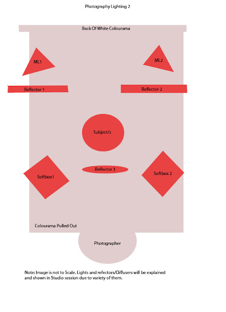
For my upcoming photoshoot on the 29th of November I will be using the Studio flash kit. I will be using two soft boxes which are synchronised to each other and can differ in the brightness and darkness of the photograph.


The subject (model) will be standing at least 5 to 6 feet away from the Colourama. I will be using a Nikon 6700-16m-mD which due to its A&S I can control the fastness and the brightness of the photographs (synchronised to the soft boxes to control light).

 
The equipment is controled by a Godox remote control which transmits the procedure to the receiver. I will be also using a reflector of light to enable light control on the models face when shooting pictures for the cover page. I may be also use a fan to produce hair movement.

Saturday 17 November 2012

The Music


This is some of the music that would be described in the magazine, and the target audience would enjoy listening to and getting information about.

Tuesday 23 October 2012

Feedback recorded from formal pitch

1). Are you sure you are going to use that masthead, why include the catch line with it?

I am still not sure about it I think I am going to change the colour of the whole masthead in order to comply with the general colour scheme of the magazine. In terms of the catch line I will implement it in my cover page however I might change the place of it depending on the photograph I will choose for the cover page.

2). How much will an edition cost?

I haven't quite yet decided, I think that as it will widespread at first via the media (internet) it will be free to see however as visits increase a price will be slowly increasing I guess that a proper physical edition if the media product enters the industry £3.99 would be perfect as it implements a psychological pricing in order to maximise profit.

3). Is IPC media the only option you have to advertise your media product?

I've been thinking that BAUER could be my plan B in a sense if IPC media doesnt work even though I highly doubt it as it has so many benefits, having the fact that it promotes NME which is very similar to my media product.

4). Couldn't your audience be more specific?

I think that the specific target audience would be people from an American or European demographic background, white ethnicity and with a reasonably high class, in addition with what I have included in my pitch. However, I don't want to be that specific as it will lose audience and hence I tried to not restrict or discriminate other social groups to again try and increase profit at least at the time in which the magazine is being released as it is difficult to enter the industry.

Monday 22 October 2012

Formal Pitch


These are some of my case studies however I am focusing more on the NME one as it relates more to my target audience.