This is my layout of my contents page using InDesign. I still have to add the pictures and the page references under the allocated subheadings (regulars, features, fashion). I also have to add information under the web page subscription. I again must decide whether I will use colours for my fonts or keep it black for formality, I will ask for feedback in order to decide and make improvements.
Thursday, 29 November 2012
First draft for the DPS
This is my first draft for my DPS created using InDesign. I have obviously not finished as I have to present my article in the right hand page but apart from that I am happy with the layout and font. I have also need to add a page reference in the right hand side of the spread. I do not know if I am going to apply colour on the spread as it looks formal in black combined with the white background from the right hand side. I will ask for feedback to arrange any more improvements which will be beneficial for the overall outcome of the project.
Second draft for my cover page
I have made the changes from my previous draft and I am content with the result I will in advance ask for feedback from my teachers and class mates for further improvement on the page.
First draft for the cover page
This isn't the finish piece by obvious reasons as their is not enough coverlines nor an explanation for who Simona (the artist) is or what the cover for her is going to be inside the magazine. I will also change the colour of the catching line as it is slightly difficult to read.I am happy with the photography chosen (editted in Photoshop by enlarging it) as it is certainly what I wanted from my photo shoot: an "alluring" image which captivates the customer immediately.
Photo shoot third outfit
This is the photo shoot with the third and final outfit I chose for my entire photo shoot period. In this one, I tried to combine both registers (formal and casual) in order to achieve a look which is not common and fit it with my "indie" genre. Hence, I chose a dress (formal piece of clothing) and added a military shirt on top of the dress to give this casual vibe.
Photo shoot second outfit
These are some of the phtographs taken in the second outfit chosen. It gives a much more casual look than in the previous shoot.
I then decided to experiment with some of the lighting to give a more vibrant sensation to the image.
Photo shoot first outfit
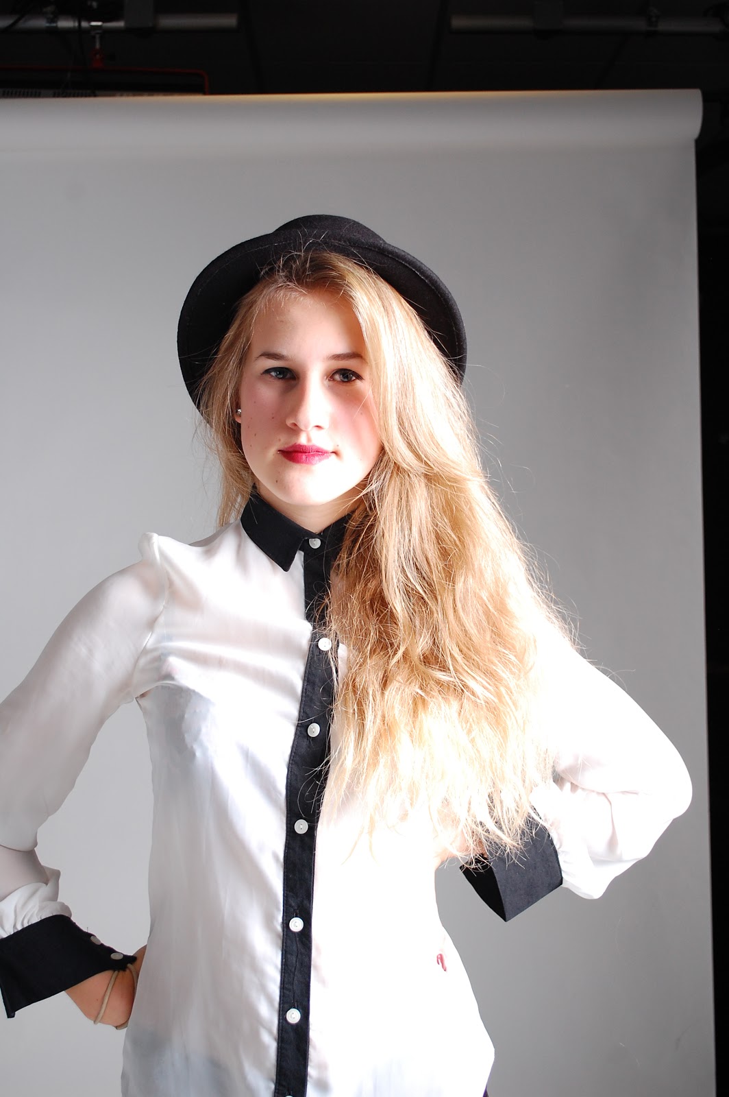
This is the first outfit chosen which presents a more formal atmosphere towards the outcome of the product. I decided not to implement any of the photographs on this part of the photoshoot as I decided to remain with two outfits when crafting my magazine as having different outfits throughout may have looked inconsistent. I also thought that the photographs may have portrayed a very formal look and I decided that being a bit more casual would be more effective for my target audience (yound students more specifically the female audience).
Subscribe to:
Posts (Atom)