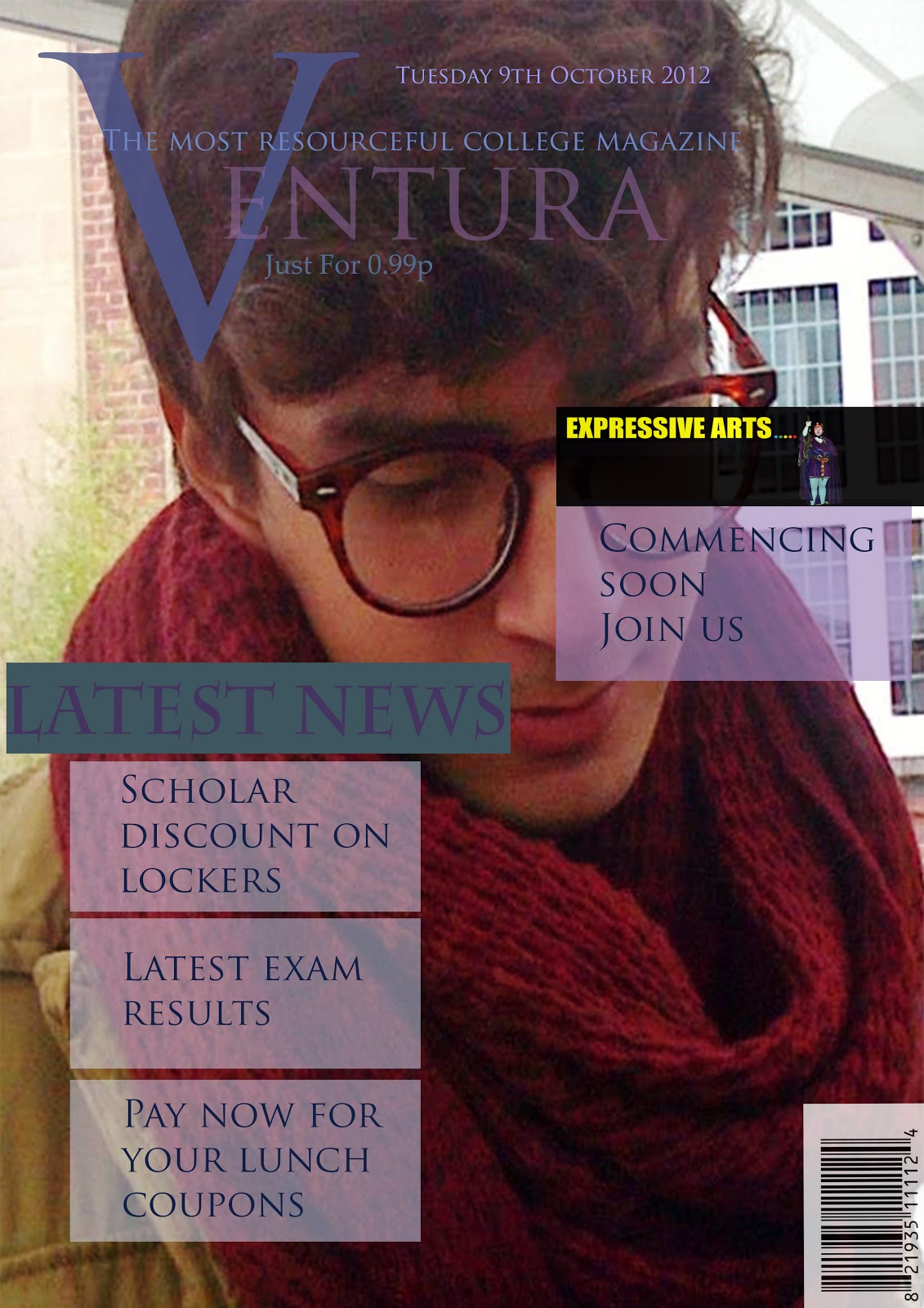
i like your magazine front cover and i like the colour scheme, i also like your design for your masthead and the images on you magazine but i think you need to write more on your features
The Masthead of your college magazine is very unique and is the best part of your front cover. However, the text box where you have ‘Expressive arts’ should be positioned lower down, on the red scarf. As your front cover seems like it’s very formal, but this makes the page look cluttered and informal. Instead of the yellow font you should use the blue that you used on your masthead; this will still make it stand out, like you wanted it too. Your contents page is very clear and simple. I would have preferred if you had a darker purple used for the background as the colours used on your front cover were dark. This will make your front page and contents page contrast together.Furthermore, you should have had ‘Contents page’ in bold , so that it was easier to see on top of the image.

i like your magazine front cover and i like the colour scheme, i also like your design for your masthead and the images on you magazine but i think you need to write more on your features
ReplyDeleteThe Masthead of your college magazine is very unique and is the best part of your front cover. However, the text box where you have ‘Expressive arts’ should be positioned lower down, on the red scarf. As your front cover seems like it’s very formal, but this makes the page look cluttered and informal. Instead of the yellow font you should use the blue that you used on your masthead; this will still make it stand out, like you wanted it too.
ReplyDeleteYour contents page is very clear and simple. I would have preferred if you had a darker purple used for the background as the colours used on your front cover were dark. This will make your front page and contents page contrast together.Furthermore, you should have had ‘Contents page’ in bold , so that it was easier to see on top of the image.