1). Are you sure you are going to use that masthead, why include the catch line with it?
I am still not sure about it I think I am going to change the colour of the whole masthead in order to comply with the general colour scheme of the magazine. In terms of the catch line I will implement it in my cover page however I might change the place of it depending on the photograph I will choose for the cover page.
2). How much will an edition cost?
I haven't quite yet decided, I think that as it will widespread at first via the media (internet) it will be free to see however as visits increase a price will be slowly increasing I guess that a proper physical edition if the media product enters the industry £3.99 would be perfect as it implements a psychological pricing in order to maximise profit.
3). Is IPC media the only option you have to advertise your media product?
I've been thinking that BAUER could be my plan B in a sense if IPC media doesnt work even though I highly doubt it as it has so many benefits, having the fact that it promotes NME which is very similar to my media product.
4). Couldn't your audience be more specific?
I think that the specific target audience would be people from an American or European demographic background, white ethnicity and with a reasonably high class, in addition with what I have included in my pitch. However, I don't want to be that specific as it will lose audience and hence I tried to not restrict or discriminate other social groups to again try and increase profit at least at the time in which the magazine is being released as it is difficult to enter the industry.
Tuesday, 23 October 2012
Monday, 22 October 2012
Formal Pitch


These are some of my case studies however I am focusing more on the NME one as it relates more to my target audience.


Sunday, 21 October 2012


Mastheads


My chosen masthead is the following as it is
more professinal and will engage better to the target audience:
For the final product I changed the colour of my masthead in order to comply with the colour scheme of my cover page and in general the whole magazine.
For the final product I changed the colour of my masthead in order to comply with the colour scheme of my cover page and in general the whole magazine.

Saturday, 20 October 2012
Music Magazine Proposal
Music Magazine Proposal
Magazine Proposal
A proposal is a document used in the media to sell an
initial idea for a product (a magazine, a film, a new radio or TV programme
etc.). It should be short and should pick up on the market research you’ve done already
(case studies, press packs). The proposal
tends to follow a set structure. You
should include the following:
·
The title of your publication
·
Your chosen musical genre(s)
·
The kind of content you’ll include- for example,
the type of artists you might include, regular items, and most importantly what
makes your magazine different.
·
Any design features, such as masthead,
lettering, colour scheme
·
Who might publish your magazine?
·
Who are the target audience (refer back to the
press pack research you’ve already done). Consider age, gender, social class,
hobbies / lifestyle
Title and Mission statement
|
|
-
Allur
-
Mission
statement: “A magazine that depicts inspiration”.
|
Feedback:
|
Genre
|
|
-
Indie/genre
|
Feedback:
|
|
Target Audience
|
|
-16-25 year olds.
-Keen on the music genre and
will like to broaden their inspiration of it.
-Predominantly, students
therefore the magazine will be cheaper for mayor profit.
|
Feedback:
|
Style
|
|
and the layout of the entire product.
|
Feedback:
|
Content
|
|
-
Underground indie artist who has recently become
known by several student groups (my target audience).
-
In the contents page: fashion, music equipment
(instruments) another group’s performance.
|
Feedback:
|
Colour scheme
|
|
-
Light brown, pale orange, salmon colours. I may
include a pale light blue colour for the background of my cover page.
|
Feedback:
|
Publisher
|
|
-
IPC media as
it is the leading UK institution and will provide more advertisement products
for a more beneficial profit for the company.
|
Feedback:
|
Cross media
|
|
|
-
Widespread over the social networks
such as Twitter and Facebook
-
Distribution: local sellers,
wholesale buyers and online sites such as amazon.com.
|
Feedback:
|
Thursday, 18 October 2012

Monday, 15 October 2012
Audience feedback and Evaluation for college magazine
By Ricardo
Reveron Blanco
Evaluation
I have used
Photoshop for both my tasks as I felt Photoshop could give both the cover and
the contents page a much more professional outlook than creating the cover with
Photoshop and then the contents with InDesign.
1). what went well?
Photography, image manipulation on Photoshop, page layout, use of text
including masthead and coverlines, journalism, layout on InDesign etc..
- I have successfully achieved a good use of Photoshop; hence both the
image manipulation and other assets within this program have been completed with
no difficulties. I also believe that my page layout and my text has also gone
well, however, I have struggled when choosing the colour of my texts, as I had
to keep in mind what my colours will connote, that they matched and that it
would not difficult when reading the texts as it may become unclear due to the
background’s colour. I haven’t used that many journalistic skills as I only
needed to create coverlines and a masthead as an article was not needed.
2). what do I need to
improve on?
- I have to keep practicing when developing my texts and my colour
scheme beforehand and I will intend to keep this in mind when pursuing my
photography sessions, to avoid having the same problem I had with my preliminary
task.
3).Write three key
points for development when producing the main task (music magazine)
1). I must plan my colour scheme and photography before taking any
actions about my photography sessions.
2).I will include more catchy coverlines which will not only engage the
reader but it will connote other matters to make such, much more intriguing.
3). I must research more on the genre of the music magazine so I can
have a clear idea of how the cover, contents pages are set up, in various
aspects; page layout, colour scheme…
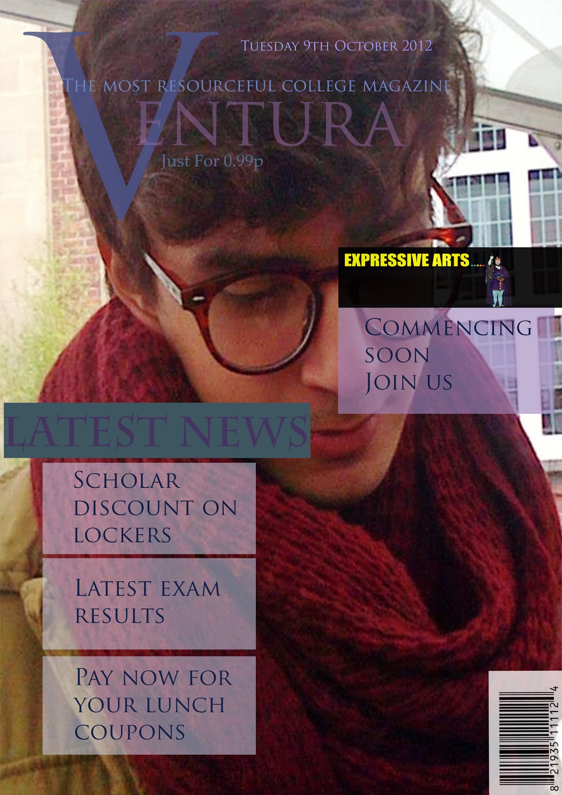
Overview:
I decided to
use the colours (violet, blue and white) as I believe they work well together
and it denotes that the target audience is young (16-18 years of age) thereby,
it engages the audience who will in the future buy this magazine. Moreover, the
colours themselves connote a sense of tranquillity within working in an
educative space and suits both male and female readers.
The image
used even though the model does not try to engage the reader with visual
contact the fact that is looking away intrigues the reader and makes them
think: what is he looking at? Which gives a positive approach as the readers
will want to find out this. The overall outfit of the model is chosen to give a
“casual” look but still kind of formal and give a sense of being in college
(the use of glasses). I chose to take the photograph in a location rather than
in a background which is solely a colour as it promotes liveliness to the cover
and suggests that the environment of the college is attractive and suitable.
The font
applied is used to connote a sense of study as the use of the font “Trajan Pro”
seems to be much more formal and “college-like”.
In the
contents page, I kept things concise and clear to ease the reader’s into being
able to travel around the magazine with no difficulties. I kept the same colour
scheme for the same reasons for which I did in my cover page. I added a
subscription space; hence usually colleges with an online website try to engage
readers into subscribing to it for economic reasons.
Audience Feedback:
-“I like the
cover picture, however I think you could improve more the page layout, the
contents is concise and easy to read but you could put much more information in
there.”
-“I like the
colour scheme but sometimes for instance in the contents page it is difficult
to read”
-“Overall, I
like all the photographs used but I think you could have used more for your
contents page”.
The feedback
given made me aware of what I should improve for the music magazine;
photographs, page layout and colour scheme.
Comments on blogger:
The comments on my college magazine have enabled me to keep in mind the chromatics, layout and conventional features of certain parts of the magazine (the contents page in my college magazine) which needs more detailed information.
Comments on blogger:
The comments on my college magazine have enabled me to keep in mind the chromatics, layout and conventional features of certain parts of the magazine (the contents page in my college magazine) which needs more detailed information.
Research skills:
Personally,
I have found several college magazines of which I have been able to identify
several characteristics that it brings and added these into my magazine. For
instance, the use of lively colours and font, such as the “Tajan Pro” for the
masthead portrays a sense of education.
Web publishing skills:
I have yet
not uploaded the cover or the contents magazine into my Blogger, therefore in
the future I must upload the tasks I complete immediately. Thereby, when using publishing you achieve a
global audience which then feedback can be given to enable improvements into
the work published. Moreover, it is cheaper than printing the whole magazine.
On the other hand, we must consider that some individuals enjoy reading
physical magazines.
Monday, 8 October 2012

Tuesday, 2 October 2012

Monday, 1 October 2012
Case Studies
Denotation:
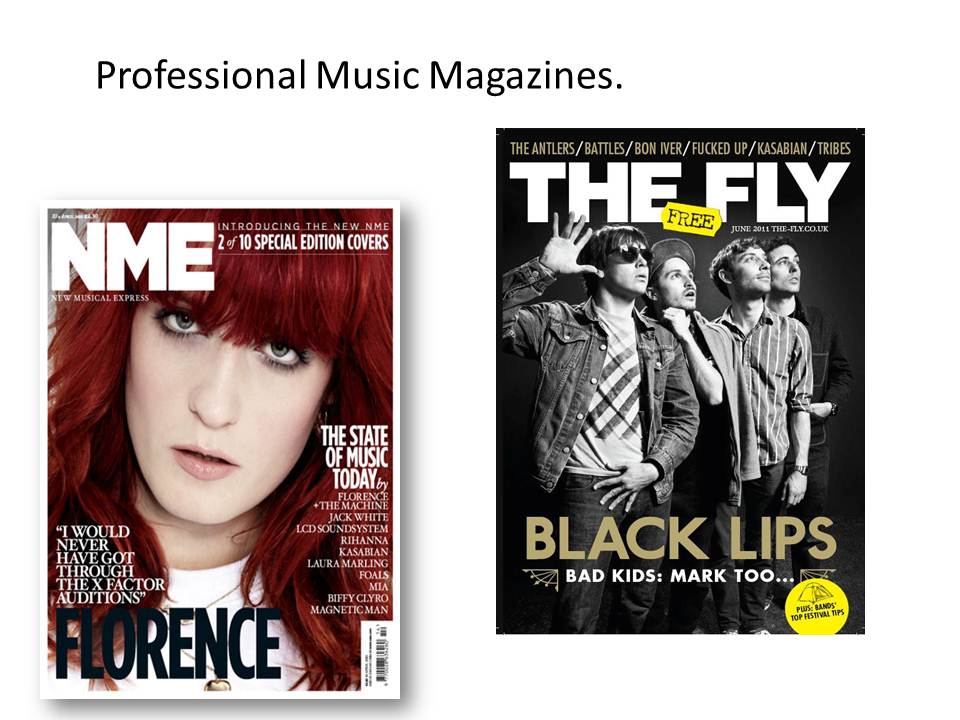
The audience may predominantly be male as they will be attracted to the female model in the cover page. Although a female audience may also purchase the magazine as they can feel inspired of the fashion and elegance of the model. A captivating and attractive female is shown.
Colour scheme
3 colour schemes: white red and black. The abundance of the colour white, connotes a sense of purity which relates to the model, who´s make-up is soft, on the other hand, we have the name “FLORENCE” in black which contrasts the whole colour scheme to make obvious that she is the main idol of this NME magazine. Moreover, we can suggest that her red hair can be included as part of the colour scheme which enhances her importance as the actual colour, red, attracts attention, we can also see there might be some “danger” behind her superficial purity as her name is coloured in black and her “fiery” hair colour may suggest an “evil” side to how she is presented from the exterior. Therefore, we might think there´s danger behind the main article which intrigues the customers as most of the audience would be young students (16-25) so they might find them interesting as the emotions connoted are ones that they have experienced before and find amusing.

Denotation:
The audience may predominantly be male as they will be attracted to the female model in the cover page. Although a female audience may also purchase the magazine as they can feel inspired of the fashion and elegance of the model. A captivating and attractive female is shown.
Colour scheme
3 colour schemes: white red and black. The abundance of the colour white, connotes a sense of purity which relates to the model, who´s make-up is soft, on the other hand, we have the name “FLORENCE” in black which contrasts the whole colour scheme to make obvious that she is the main idol of this NME magazine. Moreover, we can suggest that her red hair can be included as part of the colour scheme which enhances her importance as the actual colour, red, attracts attention, we can also see there might be some “danger” behind her superficial purity as her name is coloured in black and her “fiery” hair colour may suggest an “evil” side to how she is presented from the exterior. Therefore, we might think there´s danger behind the main article which intrigues the customers as most of the audience would be young students (16-25) so they might find them interesting as the emotions connoted are ones that they have experienced before and find amusing.
Masthead (title logotype, logo or nameplate)
The name of the magazine (NME) is specifically situated in the top left corner thus when exposed in a store the customers can identify straight away what magazine it is. It connotes a sense that the name of the magazine is the safe haven of the cover as it is coloured in white and outstands the rest of the magazine. The audience can again find the masthead easily and perhaps find it alluring.
Main image
The model, Florence, covers nearly the whole cover making it obvious that the main story is about her, the use of direct visual contact engages the reader immediately. The photograph is a close-up which is again to reinforce the idea of her importance. What the model is wearing again concords with the “pure” colour scheme. The eye contact attracts the reader, and the rule of thirds is used in the photography as what we look at straight away is Florence eyes hence her face is placed at the middle of the cover.
Lower left third
The lower left third is essential as it is the part which is solely shown when being sold in shops as the magazine is not shown full-frontage. The title must stand out as it is competing with other magazines. The audience would look at this first as it is the part shown in newsstands, therefore it is key that what is there is interesting and will engage the reader into buying it. The fact that part of the name “Florence” is showing works as the readers would know that “Florence is the one being mentioned.

The amount of images used is done to keep an interest on the audience and produce as bigger variety as possible to intrigue the biggest amount of readers as possible. The contents page follows the conventions of other contents page which apply features and regulars, this is to leave a sense of ease when finding the issues the reader is interested. Although an editor´s letter is missing which would be useful to welcome the reader into the magazine and then may attract them into the next issue.
The index of bands is positioned down the right hand side of the page; this is the same in every single magazine. This enables the audience to find information upon the bands they are more interested of inside the magazine.
The use of the bold writing in the centre of the contents page highlights the main article of the magazine, which with unison of the picture is extremely eye catching for the reader. Moreover, it compresses the story as, “our photo tribute to three decades of gigs at one of the world´s greatest music venues” which purpose is to engage the reader on reading more as the story is not fully revealed but you can have a sense direction
Advertisement for subscription
of where it is going. Furthermore, the page numbers are in red which tie with the red comment on the lower right side of the spread.
In every NME magazine, the contents page contains an advertisement for subscription. The background of which is in contrast with the main base colour in this case black over white, to illustrate it is another side-story of the magazine itself. The yellow writing stands out on the supplementary background (black) to draw attention. Thereby, it augments the chance of readers to subscribe to the weekly NME circulation.

Title
The fact that “USA” is different to the rest of the title by being in a different font, colour and size is eye catching and suggest that USA is the actual main importance of this article even though it is placed behind the model we can recognize what it stands for as “USA” itself is recognized worldwide and it is not difficult to identify the letters exposed.
Image
The image connotes an air of softness which relates to the background´s elegant colour scheme. We can identify how the elegant output of the spread is an anchorage to the model herself who is portrayed in a “lady-like” manner. On the other hand, we can suggest that the masculine public may be interested in this article as the clothes of the model are short and will attract them. Her posture is relaxed but yet composed which shows elegance but still may attract the male audience.
Structure
The structure is simple and not crowded it shows a concise yet again an elegant aura around the spread. This is to attract the audience into finding what they are interested in with ease. And to find the journalistic writing not as overwhelming as it is set in columns.
Colour scheme
The use of colours, white, black and red work well throughout the magazine, as white is being used in the background to highlight the other colours in the spread. The red is eye-catching and connotes a “sexy” appeal to the subject which is again used for men´s attention.
Writing
The font of “USA” is bigger and different as it is the main topic of this spread, the rest of the title and article uses a more sophisticates font which relates to the theme and educated young audience. The journalistic writing had been written in a formal register in order to attract the educated audience, however a more casual register is found in the use of the anchorage with the title and the performer as the lyrics of one of her songs is used. The audience would know this and find it interesting.


Subscribe to:
Comments (Atom)